The Problem
Talbots, a women’s clothing store, is not standing out in a “sea of sameness.” Their digital presence is stale, they have lost their voice, and they are not connecting with their consumers.
The Challenge
- How can we attract new customers while retaining old ones?
- How can we make Talbots stand out in a sea of endless clothing brands?
- How can we change the long-term perception of the Talbots brand?
The Ask
What does Talbots need to do in order to reinvent their brand? How can they surprise and delight their audience and become a force to reckon with in the digital space?
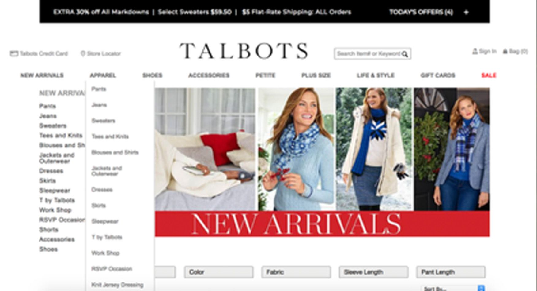
Research: Concerns with the current website
Due to the necessity of a website redesign, I began my research by viewing the current Talbots website. Sure enough, there were issues galore. Some include:
- Multiple fonts, weights, & styles
- Overcrowded layout
- Overlapping menus
- Hierarchy issues
- Inconsistant grid
- Confusing organization of products
Result: If I were a customer, I would go to a competitors site because the Talbots website was extremely confusing.
Research: Interview Findings
We conducted interviews with several women to ascertain their impressions regarding Talbots. Below are the main ideas we discovered:
Women 20-30
- Perceived that Talbots is a clothing store for Mothers or Grandmothers
- Many never entered the store
- Preferred other stores like J. Crew or online options like StitchFix
Women 30+
- Most knew the store, but were uncertain about shopping there
- Thought Talbots needed more media presence
- Liked a majority of the clothes and sales
- Loved the return policy until it was changed
- The 40-60 age range is the key demographic
Research: A strong history & unique service
We took a deep look into the company’s history. We found that:
- Talbots was founded on the principles of hospitality & inspiring confidence
- Talbots promotes values of inspiration, honor, encouragement, and empowerment
- Talbots participates in philanthropic partnerships to give back to woman in hopes they succeed their goals
Furthermore, we learned that Talbots has a strong and unique customer service model. Employees mirror personal stylists going out of their way to help customers pick outfits.
After research, we KNEW our concept for a Talbots digital rebrand must incorporate Talbot’s unique customer service model into a digital space.
Concept
To create a successful digital rebrand, Talbots needs to incorporate their stylist-inspired services into a digital space.
An e-commerce experience that utilizes style quizzes, areas to make appointments, and a social media feed recommending products would make Talbots stand out.
Furthermore, since Talbots is stereotyped as a company for grandmothers, an event to represent Talbot’s values to the public needs to be created.
Personas
While envisioning my personas, we knew some users may not enjoy the features associated with new Talbots online experience. Therefore, we decided that the new site should target users who want simple online shopping as well as users who want an experience inspired by stylists and social media.

Karen, 54
A "Classic" Customer
- Loves online shopping
- Needs clothing for nights on the town
- Confused and afraid of social media

Sarah, 22
A “Modern” Customer
- Enjoys looking at Instagram and Pinterest to find fashion inspiration
- Just graduated & needs professional but stylish clothing for her job
Information Architecture & Wireframes
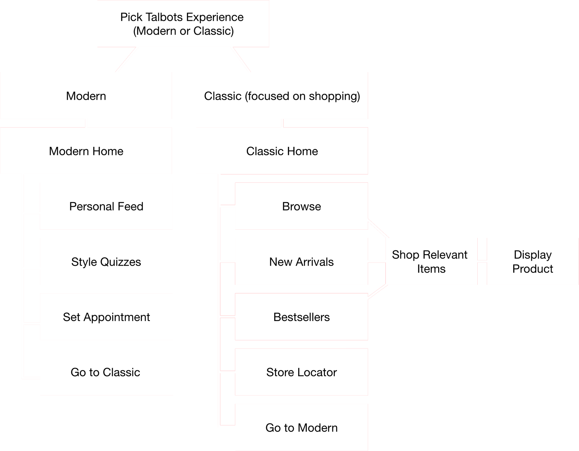
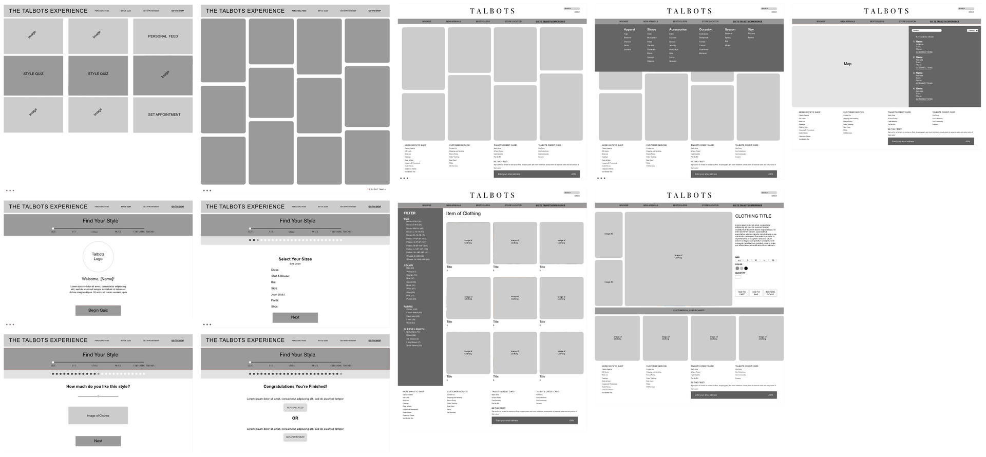
As seen in the Information Architecture, the Talbots Experience is divided into areas of Modern and Classic.
Modern incorporates Talbots’s unique and personalized customer service into the digital space while Classic improves on the confusing shopping process with the current Talbots website.

Final UI
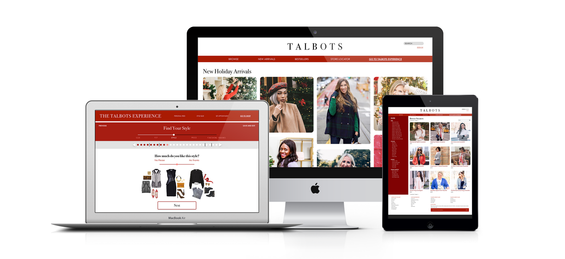
For both the Modern and Classic sections of the website, we wanted to clean up the confusing menus and product filters.
Moreover, since the current website is plain and white, we wanted to add pops of red into the design.
Showcasing the idea of inclusivity, all outfits throughout the site are worn by diverse women shown on the Talbots Instagram page.
My Takeaway
I started out this project in agony because I ended up picking Talbots out of a hat amongst a bunch of other struggling companies.
I initially resented the fact that my male partner and I were left to rebrand a women’s clothing store. However, this became one of my favorite projects due to extensive research and our own fresh concepts and designs.
Even though Talbots is a women’s clothing store, this project became our own.
Related Projects
JDRF: Where Hope Grows
Logo Design | Art Direction | Direct Mail
The Forthright Forecast
UX Design | Logo Design | Animation | Branding
Spotify Workouts
UX Design | Advertising | Art Direction
