
Nate Widom
Graphic + UX Design
Forthright Forecast Case Study
Problem
I cannot find a weather app that meets my needs. It is a chore for me to figure out how the weather actually feels outside and if the weather may change throughout the day. Furthermore, weather apps typically display the forecast in a way that overwhelms
and bores me.
As a designer that loves to think of ways to fix annoyances that I deal with on a regular basis, I know I must create a new experience that solves my issues with checking the weather.
Initial Research
Obviously, I needed to begin my journey by conducting some research and diving into what I like and dislike about the weather apps I use.
There were many apps to choose from and no app was perfect.
Research: Examining Competing Apps
Apple Weather
The user experience in the Apple Weather app is brilliantly simple. However, it lacks some critical data I’d look for and the interface is boring.
Likes: A clean and simple design! Scroll left + right to check the day’s forecast and up and down for a weekly forecast.
Dislikes: The app seems boring and only states data. I can’t see how the weather actually feels outside, radar maps, and suggestions for proper clothing to wear.
Accuweather
The Accuweather app is unique due to its in-depth data. However, the complicated way the data are displayed makes the app confusing as well. Also, Accuweather bores me just like Apple Weather.
Likes: The Accuweather app displays much more data compared to Apple. The app shows radars, maps, minute casts, among many other features.
Dislikes: While the app displays a lot of useful data, it overwhelms me because it is not displayed in a clean and simple way.
Research: Survey Time!
Obviously, I did not want to rely on my own opinions to design my own weather app. Therefore, I decided to conduct a survey and the results are provided below.
General Themes with the Participants:
- All participants check the weather on their phone at least once a day
- A majority of the respondents use the standard weather app on their phone
Important Needs
- An app that is easy to understand
- Radar features
- Predicts weather throughout the
day and week - Feature that displays how the weather feels outside
Research: My Conclusions
While I now have insight on the basics of what makes a strong weather app, I know that a weather app that nails the basics won’t be enough due to the vast number of competing apps. Therefore, I had a bit of a challenge. I went back to my original issues with weather apps and remembered that all of the weather apps I’ve come across are boring and lack personality.
I then knew I had to think of ways a weather app can address those concerns. Considering all of the weather apps I’ve examined lack personality, I realized my app must display the weather in a unique voice rather than simply state the weather.
Concept
A weather app with a simple and clean user experience paired with language that brings out personality would make users want to check the weather and find the information they are looking for.
Goals
- Intuitive and attractive UX
- Language that brings out personality
- Contains a vast amount of weather data without being overwhelming to users
Challenges
- How can a weather app stand out in the sea of other weather apps (especially with a standard app on most phones already)?
- How can a weather app convey a voice that relates to users?
- How can the weather be conveyed with data in a clear and concise way?
Personas
I directed my personas to a younger audience who would be deeply affected by the weather. Furthermore, my personas would likely appreciate a sense of humor.

Mike, 31
- Has an active lifestyle and loves the outdoors
- When not active, enjoys going to concerts and comedy clubs
- Uses weather apps to plan his lifestyle & daily clothing choices

Allison, 23
- Opinionated and vocal
- Hates waking up in the morning
- Suffers from Seasonal Affective Disorder (SAD) and is unhappy on a cloudy day
- Wants to know when the next warm, sunny day will occur
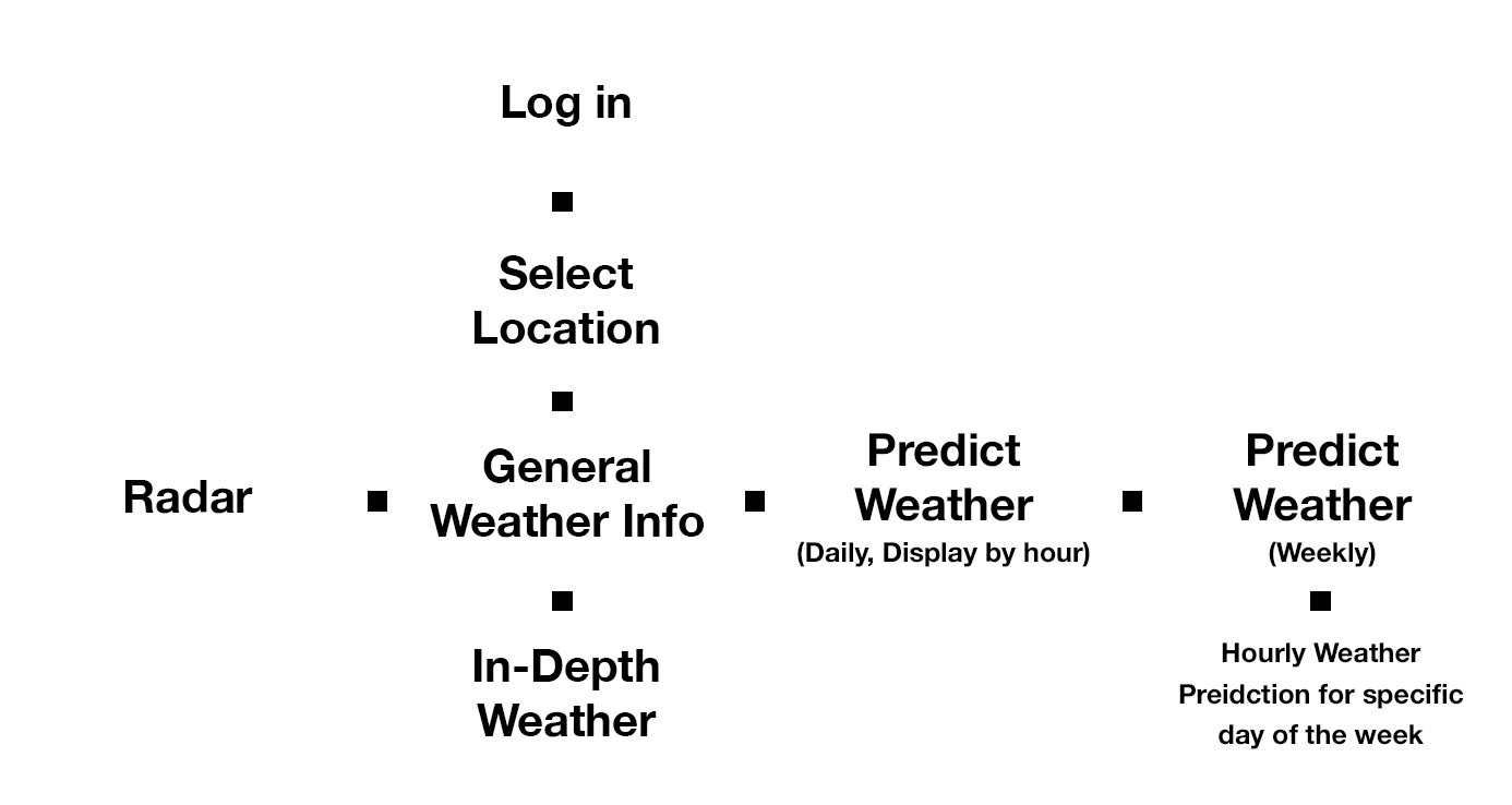
Information Architecture
Physically writing down desired pages on index cards and moving them around really helped me visualize a clean and simple layout.
Referring back to my concept, I believe the architecture should be as simple as possible while still allowing room for detailed data.
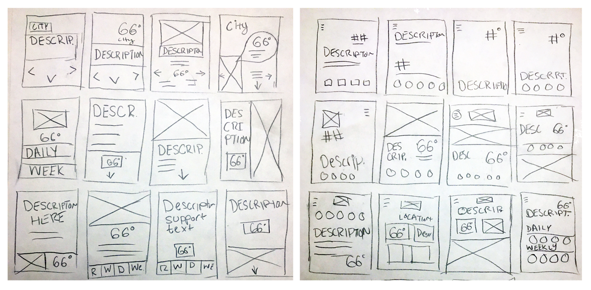
Drawn Sketches
After creating the information architecture, I decided to conduct a series of sketches to develop a conceptually strong + clean interface for the app.
Due to a strong personality within the app, I believed that a design that first introduced a description of the weather to the user would make sense for my concept.
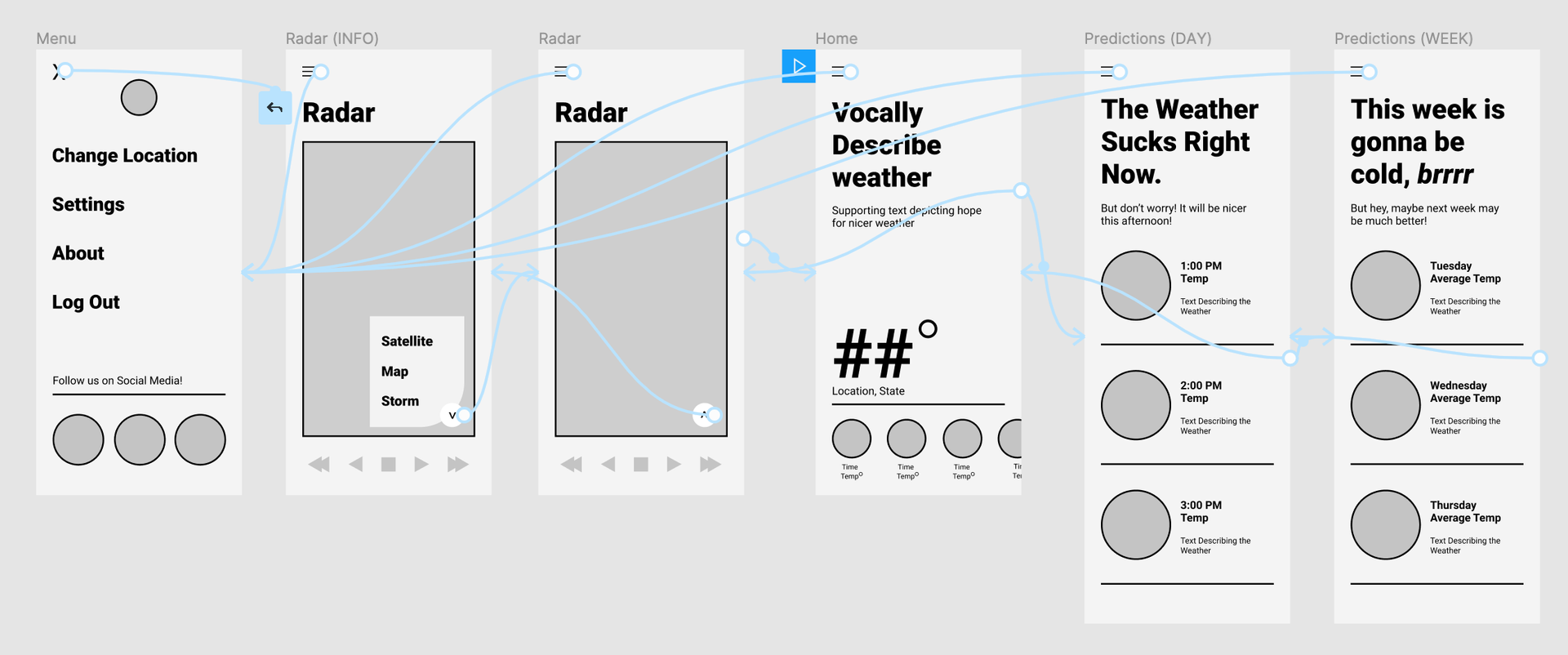
Wireframes
To create a wireframe, I took my strongest sketch and created a simple design in Figma. Inspired by Snapchat and the standard iPhone weather app, I prototyped my design to utilize swiping to navigate between screens.
Branding, Colors, & Typography
I desired the colors throughout the app to be synonymous with the colors of the weather we see in everyday life. As for type, I wanted the app to utilize simple but a clean and quirky typeface.
Primary Font:
Mulish
abcdefghijklmnopqrstuvwxyz
abcdefghijklmnopqrstuvwxyz
Secondary Font: Raleway
abcdefghijklmnopqrstuvwxyz
abcdefghijklmnopqrstuvwxyz
Logo Exploration
I wanted to match the simplicity of the app wireframe in the logo. Obviously, I was inspired by a weather vane and the rooster on top of it.
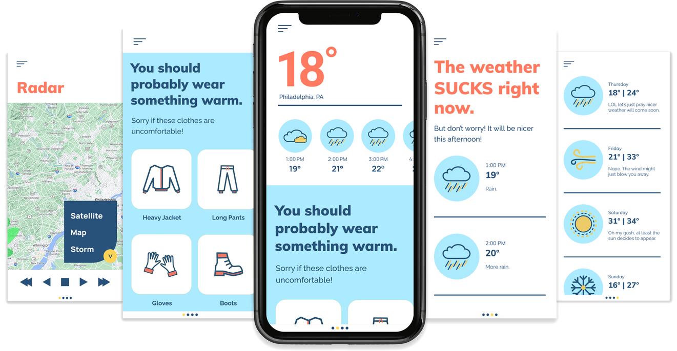
Final UI
I’m very happy with the way The Forthright Forecast turned out. Let’s just say that I want my app design to be released to the world!